Going the Extra Mile with Tasks and Feature Requests
You know what really makes a product, team, or organization great? Responsibility and initiative – when people take tasks they were handed and own them. It’s so easy to define boundaries for ourselves and say “I am responsible for X thing and that’s what I will do. But anything beyond that is not my responsibility.” It gives us less responsibility and protects us when things fail.
For example, if a product manager gives me (as a designer/developer) a task, I can complete it just as specified and hand it back. If any critique comes back outside the well-defined boundaries of what I completed in the task, I can simply say: “Well that’s not my fault. That was not was not specified in the task.” and defect responsibility back to the product manager or somebody else. But you know what? This is what makes products subpar.
If you want to be great, as an employee or just as a person, you have to realize that most of the time your job isn’t clear-cut and well-defined. It’s not just stuff handed down with the mandate “do X thing”. Your job, especially as a designer, is a two-way street. Think of your mandates rather as suggestions. As Paul Rand once said:
As the material furnished him is often inadequate, vague, uninteresting or otherwise unsuitable for visual interpretation, the designer's task is to restate the problem. This may involve discarding or revising much of the given material. By analysis (breaking down of the complex material into its simplest components - the how, why, when and where) the designer is able to begin to state the problem.
Your job is taking the liberty and creative freedom to change, enhance, or even detract from the original request if it’s for the betterment of the end result. It’s something I have to keep learning every day. Let me give a recent illustration of how this happened to me.
My Story: Enhancing a Feature Request Task
A few weeks ago I was working on the Assignment Desk application for Time Inc. when I received the following task in Asana:
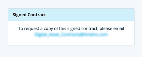
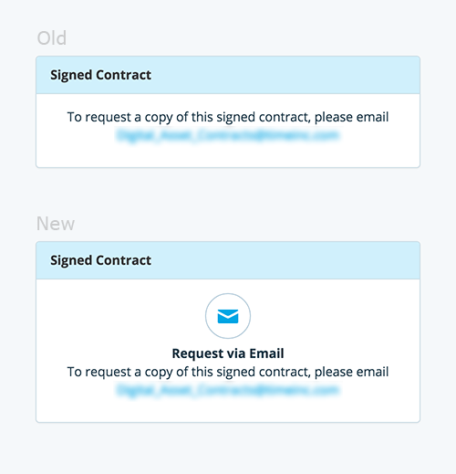
When a contract is signed, display text instructing the user to request the signed contract. Text: "To request a copy of this signed contract, please email
person@timeinc.com"
That sounds pretty straight forward right? I jumped into the application’s codebase to see the context of the task’s request and get a sense of the logic involved. Once found, I dropped in the new functionality specified in the task and thought “Well that was easy. Boy am I efficient!”. The new module looked like this:
Now, I could have very easily just left things like that. I did just what the task had asked. No more, no less. I could have sent the task back with a quick turnaround time, proved my efficiency in resolving tasks, and moved on to the next task. But (I suppose it was the designer in me) a part of me said “that’s not good enough, it could be better!”. So, I decided to go outside the boundaries defined in the task and try to make the module a little better.
First, I started with the aesthetics. Rather than spend time creating a unique graphic (because, let’s be honest, you can spend time refining just about everything but you have to remember the law of diminishing returns: don’t spend 10 hours on a 50x50 pixel graphic when 30 minutes will do — you gotta weigh priorities), I leveraged our existing icon library to come up with a slightly more graphical representation of what was being communicated in that module:
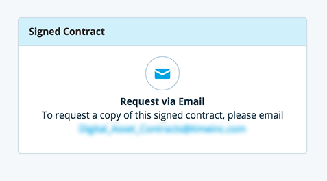
This felt much better. The block as a whole now communicated the essence of the text: “click to request the contract via email”. This felt like an enhancement when viewed from the perspective of a user who is familiar with the system. Rather than plain text that they would have to read each time to understand (because you can’t know at a glance what text says), they would instead see a consistent graphical representation of an idea, i.e. “click to request via email”. As they grew familiar with the app, they would begin to instinctively know what was being asked in that module without actually having to read the text each time. Plus, it just looks better doesn’t it?
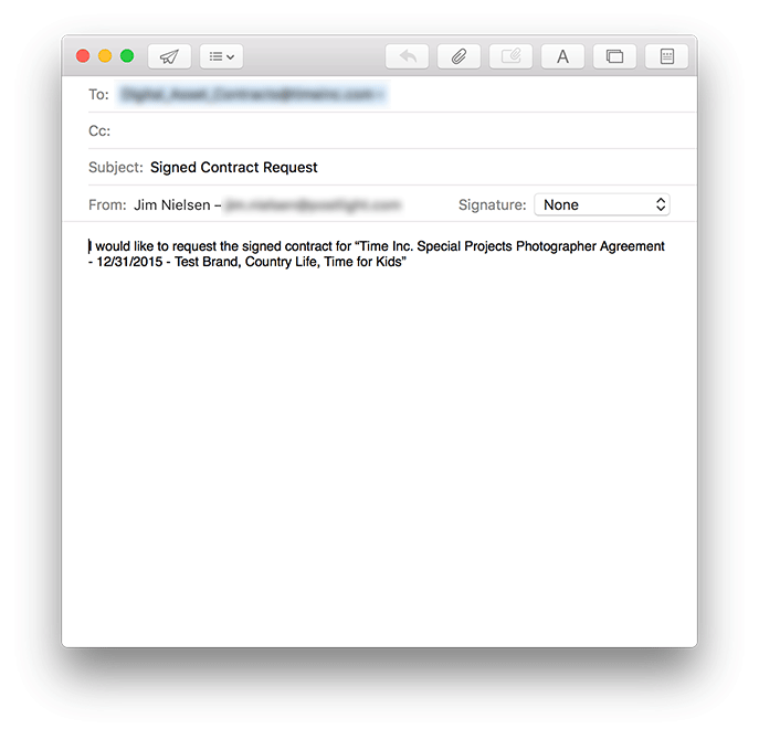
After this visual enhancement, I began to think the feature request through beyond merely aesthetics. It hit me that what the task was really asking for was the ability to request the signed PDF contract of the currently visible digital contract (which was just one of thousands in the system). How would the recipient of the email know what PDF contract was being requested? As the feature stood, when you clicked to send an email, you would get something like this in your email client:
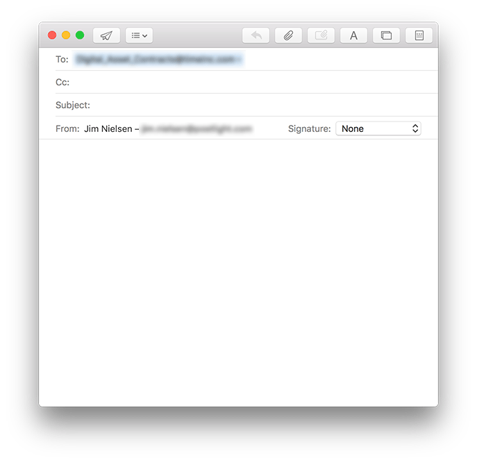
It’s a blank email. That left a lot of work up to the user to remember and fill out the details around the contract they were requesting. I realized it would be much better if I populated the information of the currently visible contract directly into the email, that way the user could simply review it, add any additional information, and then click “Send”.
So, using the mailto:email@domain.com?subject=Hi&body=Hello syntax (enhanced slightly for sanity checks), I pulled the data of the currently visible contract and populated it into the email:
With these enhancements, none of which were mentioned in the original task request, the feature finally felt complete. By taking the time to think through the entire UX of the task request’s essence rather than just the task request’s specific instructions, I ended up with better, more holistic solution.
Lessons Learned
It’s the small pieces that make your software as a whole. If you don't consider the little things, the big thing can never measure up to your vision because its composite pieces were never cared for.
As has been said: “And whosoever shall compel thee to go a mile, go with him twain”. Or to borrow a similar metaphor, sometimes it’s more about the spirit of the task than the letter of the task. Take time to consider what is actually being asked, rather than blindly completing the request. Building a great product is often best accomplished as a two-way conversation, not a one-way dictation.