Logo Integrity Brought into Focus
tldr; An analysis of my experiment (http://jim-nielsen.com/logo-integrity) in testing iconic logos and their visual integrity against a gaussian blur. Additionally, a technical behind-the-scenes breakdown of how I built the experiment.
I was reading Paul Rand’s A Designers Art and stumbled across this quote:
How far out of focus can an image be and still be recognized? A [logo] which is subject to an infinite number of uses, abuses, and variations whether for competitive purposes or for reasons of “self-expression,” cannot survive unless it is designed with utmost simplicity and restraint—keeping in mind that seldom is a trademark favored with more than a glance. Simplicity implies not only an aesthetic ideal, but a meaningful idea, either of content or form, that can be easily recalled (Paul Rand, A Designers Art 31).
I found this a rather intriguing concept. Prior to our current digital world of 100% pure reproducibility, one significant test of a logo's effectiveness was to see how well it could endure visual entropy in real world use. For example, how well could a logo on letterhead maintain its visual integrity and recognizability after being faxed multiple times? Each time a letter was faxed it slightly lost its visual integrity to the point of becoming unrecognizable or unreadable. Thus, a well-designed logo would maintain it’s readability and recognizability through the stages of visual entropy that result from real-world use.
In contrast, today’s digital technology ensures 100% exact reproducibility. Because digital files are a 1:1 mirrored copy of their original, they do not lose any visual integrity and are dependent solely on the integrity of the original file. Due to this, many designers today might not fret over a logo’s resistance to visual entropy. Sure, things like higher pixel density in 72ppi or 144ppi screens may cause slight blur issues when displaying a logo, but those issues have more to do with sharpening an image than avoiding the its complete demise into unrecognizability.
I decided to try a simple experiment: take some of today’s most iconic, ubiquitous logos and see how well they hold to being distorted.
The Experiment
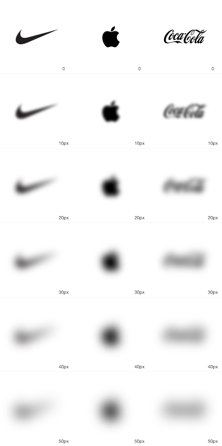
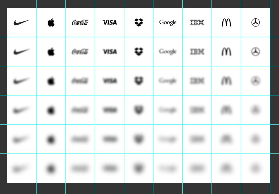
I decided I would test each logo’s visual stamina by bringing each one out of focus incrementally with a gaussian blur. At what point would each logo become unrecognizable? Would some of them lose their integrity after a small 5 pixel blur? What about a 10 pixel blur? Which iconic brand logos could go the furthest out of focus while still retaining their visual integrity and recognizability?
Additionally, I wanted to remove color from each logo because it can be a vital ingredient in brand recognition. For example, perhaps all you see is a blur, but if that blur is the color magenta you might more easily guess “T-Mobile” as opposed to some other brand. Boiling all the logos down to their essence — their shapes and forms in single color — helps establish and verify how well the mark can stand on its own.
Furthermore, I wanted to test logos that were abstract symbols rather than typographic represenations of the brand name. For example, Google’s logo is a logotype because the logo itself is the name of the company. Whereas Nike’s “swoosh” is an abstract logo mark. Logo marks really test the recognizability of a brand because they do not spell out the company’s name and instead rely on a mental association between the mark and the company.
So how did each logo fare?
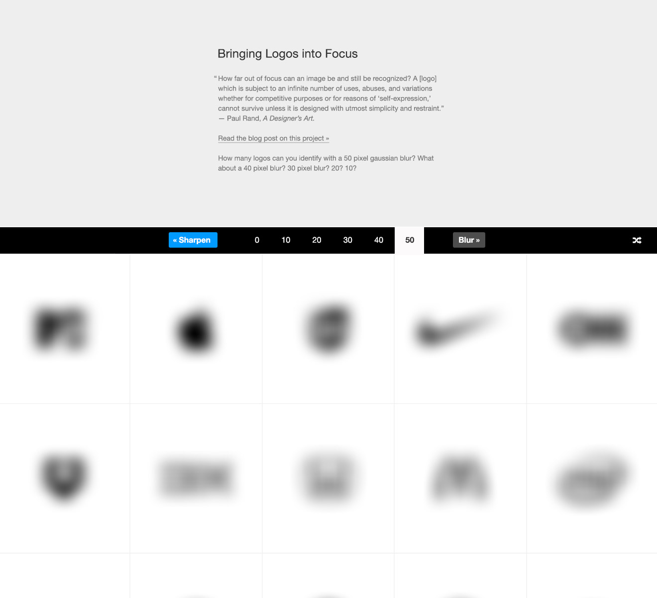
The Worst Performers
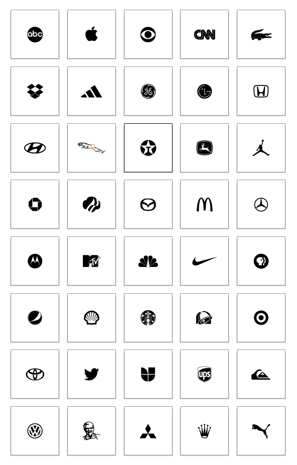
Logos which shared the same visual form fared the worst. For example, circular logos like ABC, General Electric, PBS, and CBS all consist primarily of a circle with a distinctive mark cut out of it. When heavily blurred, all of these logos begin to look alike and become indistinguishable from one another:

This is not to say that circular shapes are necessarily a poor choice when designing a logo. However, upon being brought significantly out of focus they do lose their visual distinctness and, thus, recognizability.
The Best Performers
In contrast, the unique logo shapes of Nike and Puma seemed to fare the best. As you can see, towards the blurriest end of the spectrum the logos seem almost unrecognizable:

However, these two marks retain a portion of their recognizability due to their distinctive forms which maintain at least some degree of visual integrity (as opposed to other more symmetrical logo designs which begin to all look the same when heavily blurred).
Nike, for example, holds up rather well when heavily blurred due to it’s horizontal elongation and scaling visual weight from left to right. Similarly, the perpendicularity of the tail on Puma’s mark helps to retain its unique visual discernibility.
Experiment Conclusions: What I Learned
A significant ingredient in determining how easily you recognize a logo not only has to do with its design but also its ubiquity. The more recognizable a mark is and the more you’ve been exposed to it often dictates how easily you’ll recognize it. For example, you might see one mark that is significantly out of focus and guess it is as "McDonalds" rather than "Dodge Ram" because you've been exposed to the McDonalds mark more and thus make that connection. Repetitious exposure to a brand’s mark leads to higher recognition. Thus, it can be inferred that the efficacy of a brand’s mark is often less dependent on its design than on its consistent, repetitious exposure to the public eye.
Some might think this means there is no substance to logo design, that one need only create a logo, any logo, and then just expose it as much as possible to the public view. This assumption, however, is not entirely true. Certain shapes and forms lend themselves to be more easily remembered. Additionally, shapes, forms, and colors all have inherent societal meanings which cannot be overlooked when designing a logo. For example, if you were in the funeral business, you wouldn't want to use a logo that looks like the skull and cross bones, no matter how much exposure you give it.
Lastly, this specific test of a logo’s recognizability when out of focus has shown that a logo’s form can go a long way in strengthening its recognizability. Circular forms are very common and when heavily blurred tend to all look the same with no unique visual identifier. More abstract shapes however, like Nike and Puma, tend to retain their recognizability due to unique and stark contrasts in form which lead to easier recognizability.
Implementing the Experiment: Technical Details
Disclaimer: The remainder of this post will touch on the technical side and story of how I built this experiment. If you're not interested in that, feel free to stop reading now. Or check out one of my other experiments/blog posts.
For those of you who decided to venture on, I welcome you. Let me start by telling you that this experiment all began with a single thought, spurred by Rand Paul's quote. ... What follows is a quick overview of the iterations I went through in order to arrive at the current design and implementation you see today.
Iterations Leading the Current Design
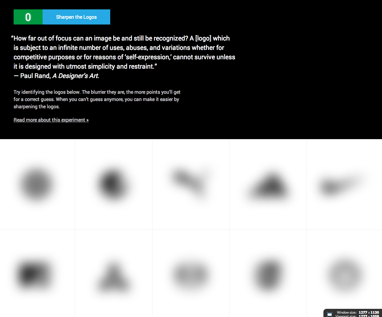
Phase 1: At first, I thought I would just experiment by doing a gaussian blur in Photoshop on a couple different logos, write a blog post about it, and call it a day. So I ended up with a PSD with sliced up logos like this:
Phase 2:: Once I got into Photoshop and blurred a few logos at different rates, I realized it would be way cooler to dynamically blur logos in the browser and see the point at which each logo loses its recognizability. So I mocked out an interface like this:
The integers in the UI would serve as controls to easily switch back and forth between heavy and light blurs. This allowed dynamic comparison between each logo, making it very easy to see which logos best retained their recognizability.
At this point, the thought crossed my mind, “what if it were a game where you could try and guess what the blurred logo was?” After showing the working prototype to a few people, the feedback was the same: this should be a game! (Thanks to @thegaw for his patient, supportive feedback in this process).
Phase 3: My final phase led me to create the guessing game you see today. I explored a few more UI changes in Photoshop and then tweaked my working HTML/CSS/Javascript prototype to match the mock I had created. As is my style, my mock wasn’t set in stone. I left myself room for making flexible design choices while building the page in the browser:
Implementation Choice: SVG or IMG
I kind of just naturally started using images in the prototyping stage, especially because I wanted this site to be accessible and what's more accessible than a simple <img> tag? This led me to think, “I'll just create two big sprites (normal and retina) of all the logos and their respective blurred representations.” However, in doing so, I ran into an issue I had not previously encountered: on iOS there is an image size limit because the iPhone/iPad only have so much working memory. Because I was planning on having lots of logos, this resulted in a gigantic sprite which loaded fine on desktop but broke when I tested it on my phone. Then it hit me: why not use SVGs!
A great advantage to using SVGs is that you can blur them on the fly in the browser using SVG filters. For older browsers that don’t support SVG filters, I would just load an image for each logo and its blurred variations. Initially I though this would be simple. I could check the browser’s support for SVG filters using Modernizr and then display the logo by loading the supported file type as a background image using CSS, like this:
.svg-filters .logo {
    background-image: url(nike-logo.svg);
}
.no-svg-filters .logo {
    background-image: url(nike-logo.png)
}
Simple and elegant no? Unfortunately, it’s not that simple. Even though browsers may support SVG filters, they don’t all support them in the same way. Some allow SVGs as <img> elements, others allow SVG elements directly inline with the HTML, while others allow SVG as background elements in CSS (as shown above). I found that the only truly cross-browser method for displaying SVG elements while simultaneously being able to apply filters to them was by embedding the SVG directly inline with the HTML. To accomplish this, I used javascript to load the element <div class="logo"></div>. If SVGs are not supported, the following CSS works for a static image fallback:
.no-svg-filters .logo {
    background-image: url(nike-logo.png)
}
If SVGs are supported, however, then I directly inject the SVG element inside the .logo element using javascript. Because of this approach, the logos are not loaded into the page’s HTML by default. They are only visible depending on the HTML class applied by modernizr.js which means users with Javascript disabled won’t see any images, and that’s ok. The page’s markup still allows them to access the images if they want because each logo is linked to the PNG version of the image (which shows the logo and its blurred variants):
<li class="brand">
    <h2 class="brand-name">
        <a href="assets/images/build/logos/jpgs/nike-logo.jpg">Nike Logo</a>
    </h2>
</li>
As you can see, I tried to progressively enhance this page as I went along. For users who didn't have javascript turned on, they could still access the blurred logo results of the experiment by clicking on each brand.


Users with javascript, however, received the enhanced ability to directly manipulate the logos’ blur values right in the browser, while simultaneously comparing those results across brands.

Programmatically Creating Each Logo Variation With ImageMagick
In the prototyping stage, I started creating each logo and it's blurred variants in Photoshop. I sliced and diced them for easy exporting, but as the number of brands increased my Photoshop file became unmanageable.
The biggest downside to this approach was the it all had to be done by hand. What happened when I decided I didn't want to do gaussian blurs at 5, 10, and 15 pixels, but rather at 7, 14, and 21 pixels? Or some other measure? All that work would be wasted. Wasn’t there an easier way to do this? As a designer, I rarely do image manipulation programatically. However, I'd vaguely heard of this command line tool called ImageMagick which I thought might let me do this kind of batch image manipulation / processing. I already needed the SVG versions of each logo. Why couldn’t I just automatically create the all image assets I needed from each SVG logo?
After a little research, I discovered ImageMagick was just the tool I needed. After quite a bit of trial and error, along with research into ImageMagick’s documentation, I figured out just the commands I needed to programmatically create a single image for each logo and its blurred variations.
The final process looks something like this:
I have a master .ai file with vector versions of each logo on matching canvas sizes, which allows me to easily create a set of logos which are proportionally sized in relation to one another.
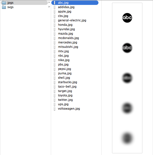
Each logo gets exported as an individual SVG file to a single directory assets/images/src/svgs
I process all SVG files in the folder using a small bash script of commands. This script uses ImageMagick and ImageOptim to dynamically create, convert, stitch, and compress all images required for the site. For example, it takes the file nike.svg and: 1) Converts it from SVG to PNG, 2) Creates PNG versions of all the blur variations, 3) Stiches all those individual PNGs back into a single file, 4) Compresses the image and sticks it into the build directory.
This results in each brand getting its own sprite which consists of the logo in original form along with each blur variation. These serve as fallbacks in the event that someone’s browser does not support SVG files. They also serve as the linked images for those without javascript.
This approach allows easy image regeneration in the future. All I would have to do is modify my image manipulation script and regenerate all the necessary images using the original SVG files.
One Master List of Logos
In creating this site, I had a collection of logos. The problem, however, was that I was maintaining separate lists of logos in HTML and CSS. If I removed, added, or changed a logo in one list I’d have to change it in the other as well. This became a headache. My solution? Create a “master” JSON file with the information I needed. Here’s an example:
{
    "abc": [
        "ABC",
        "American Broadcasting Company"
    ],
    "addidas": [
        "Addidas"
    ]
}
Because my development version of the site is written in PHP, I read in the JSON file and looped over it to create each logo’s HTML list node and corresponding information. For example, my rendered HTML looked something like this:
<li id="nike" data-answer="[Nike]"> ... Nike ... </li>
<li id="bps" data-answer="[PBS, Public Broadcasting Service]"> ... PBS ... </li>
The data-answer attribute held an array of possible answer values. I used javascript to leverage these multiple values in determining whether the user had entered the correct name of the brand (if you saw the logo for “PBS” and entered “Public Broadcasting Service” as your answer, it would be correct).
As for the CSS, I also used PHP to parse the JSON file and create a .scss partial which contained a list variable of all the logos being used. I could then use that list in SASS to create selectors for all the logos I was using in my project. Here’s an example:
// SVG filters not supported
.no-svgfilters {
    @each $logo in $logos {
        ##{$logo} {
            .logo {
                background-image: image-url('logos/jpgs/#{$logo}.jpg');
                background-repeat: none;
            }
        }
    }
}
As you can see, having this “master” JSON file allowed me to easily add, remove, and modify logos in the project. Those modifications would then propagate to my various files. Adding a logo to the project was as simple as: 1) add the SVG file and run the image generation script, 2) add the logo’s name(s) to the JSON file, 3) drink some lemonade (this step was optional).
End Results
This progressively-enhanced, responsive design makes this site quite accessible. On a mobile device? It works. On a tablet? It works. Have javascript disabled of the CSS doesn’t load? You can still access each individual logo and its blurred variations. No SVG support? You get served regular images. It just works.
It was a fun experiment to build and test. What I learned will inform many of the projects I work on in the future.
Have questions or what to know more? Find me on twitter @jimniels.