Unintended Visual Relationships
Establishing a grid is a great way to organize and structure design elements. In addition, by breaking the organization and structure of the grid you can emphasize visual relationships between design elements.
Drawbacks to Grids
Recently I came across a subtle and often overlooked side-effect of grid-based design: unintended visual relationships. An example of this can be found in the Wordpress theme Portfolium
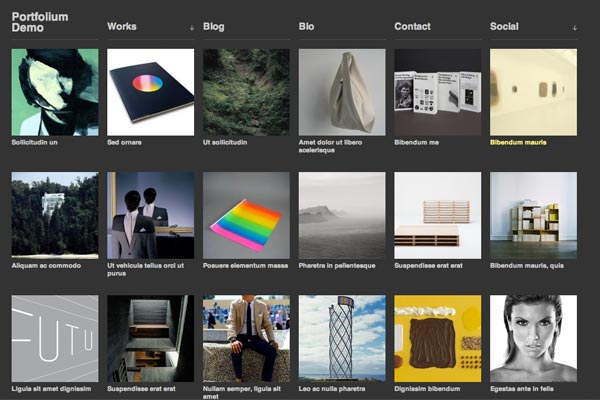
Overall, it's a well executed grid-based design: organized and structured; however, the alignment of the navigation to the thumbnail grid suggests visual relationships that are nonexistent.
For example, take a look at the words at the top of the page: they align to the thumbnail grid. This suggests a columnar relationship between each navigation item and the thumbnails below them. However, no such relationship actually exists.

Rows, Columns, or Neither?
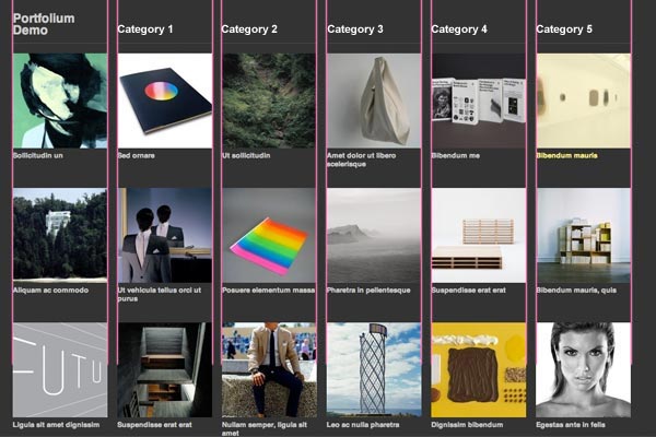
This type of unintended visual alignment is confusing. The words in the navigation align with the columns below them, suggesting some type of organization or categorization. Even the light grey lines below navigation item are visually separated which helps reinforce the idea of a column layout. Even so, there is no relationship between the navigation items and the thumbnails below them.
On the other hand, if you wanted to suggest a relationship between the navigation items and the thumbnails below them, the alignment of Portfolium would be ideal. For example, if you wanted to separate and categorize the thumbnails by column, this type of alignment would work very well:
A Better Alignment
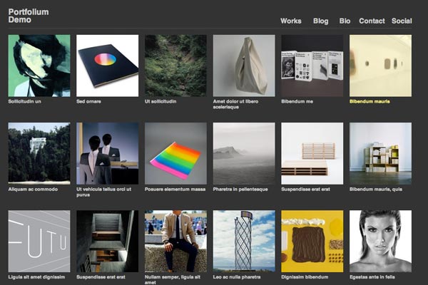
In the example of Portfolium, not aligning the navigation to the thumbnail grid would break the grid and provide a visual separation between the sections of image thumbnails and navigation. In addition, making the light grey line at the top a solid, unbroken line helps visually separate the header from the content.
It's possible that the creators of Portfolium had a purpose in mind when designing the theme the way they did. However, I don't see it. Take care to always be aware of how your grid elements are being aligned. In grid-based design, it's easy to unintentionally suggest visual relationship that don't exist.