Addition By Subtraction
I still think saying no is important. In that vein, here’s something I shipped by removing functionality (and I think my site is better for it).
For the longest time on my icon gallery sites, you could view a list of icons in four pixel dimensions:
- 56×56
- 128×128
- 256×256
- 512×512
Each of these sizes could be accessed via a control on the website. This has been true for years on my site, whether it’s the current site:

Or an older version of the site:
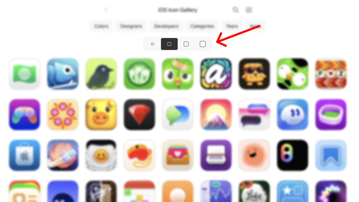
By default, I loaded the 128-pixel version of the icons. But if you wanted to see other sizes, you could.
However, the more I used the site myself the more I thought, “Four options is too many”.
When it comes to choice, what I really wanted was:
- Default
- Smaller
- Bigger
(Plus three is always a good number, unless you have a reason otherwise).
So I removed the big 512 option. If I want to study an icon at that size and detail, I click through to the icon’s detail page.
Now there are three options for list views: 56, 128, and 256. Small (great on mobile), 128 (great by default), and big (let me see more detail).
It’s simple to think about:
- You get a size by default.
- Not big enough? Go up a size.
- Too big? Go down a size.
You don’t need to think about it anymore than that.
I mean you can, but I’ve found I don’t need to. So I’ve taken that off your plate. Less cognitive overhead.

Maybe one day I’ll add a slider and make it all dynamic. But for now, I like this small addition by subtraction.